LOGO PROJECT
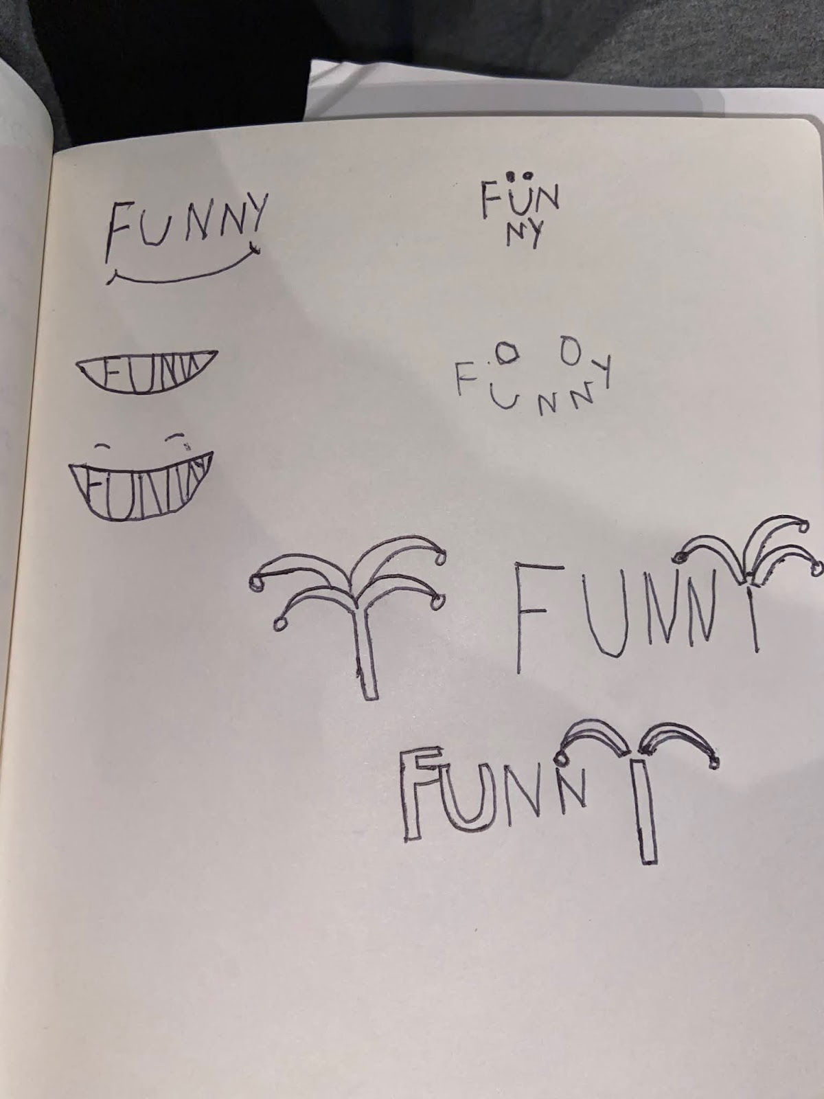
This is what it all started off with. Although I disliked my terrible hand drawn version of my final logo, I knew it was the right design to go with and that I could execute it better on illustrator.

This was my final version of my Logo. Im very proud of this simple yet effective design. The misspelling of the word funny (spelt Funni) I feel adds to the playfulness and idea of the logo. The hat element was by far the most difficult part of this project.

These are the black and white versions of my logo. I like them slight less then the color because I believe they lend a more serious tone than I originally intended. However I still think it looks great and was happy with the details and lines within the hat.


Comments
Post a Comment